
How to Choose Matching Bead Colors
Table of Contents
- Understanding Bead Color Theory for Beginners
- How to Choose Matching Bead Colors Using Color Harmony
- Best Color Combinations for Jewelry Design
- How Bead Finish Affects Color Matching
- Alphabet Letter Beads Color Coordination
- Digital vs. Physical Color Matching
- Step-by-Step Process for Choosing Matching Bead Colors
- Common Mistakes to Avoid When Matching Bead Colors
- Frequently Asked Questions
Last Updated: October 1, 2026
Understanding Bead Color Theory for Beginners
Choosing matching bead colors might seem simple at first. Pick colors you like, string them together, and you're done. But there's real strategy behind it. Understanding how colors work together transforms your designs from random to intentional. This guide from Barkers Creative Designs breaks down the fundamentals so you can make confident color choices every time.
Color theory gives you a framework. It explains why certain combinations feel harmonious while others clash. You don't need an art degree to use it. A few core concepts unlock endless possibilities.
The Color Wheel and Primary Colors
The color wheel is your foundation. It organizes colors in a circle based on how they relate to each other. Think of it as a map for color decisions.
Primary colors are red, yellow, and blue. These three cannot be created by mixing other colors. Everything else builds from them.
Secondary colors come from mixing two primaries: orange (red + yellow), green (yellow + blue), and purple (red + blue). Tertiary colors blend a primary and secondary together, giving you even more options.
When you understand this structure, you see why certain bead combinations work. A red bead next to an orange bead feels cohesive because orange contains red. They share DNA.
Hue, Saturation, and Value Explained
Hue is the color itself: red, blue, green. It's the name of the color on the wheel.
Saturation measures how intense or muted a color is. A bright, vivid red has high saturation. A dusty, grayish red has low saturation. This matters enormously for bead matching. Two beads with the same hue but different saturation levels can look completely different when strung together.
Value is how light or dark a color is. A light pink and a dark burgundy are both red-based, but their values differ dramatically. Pairing beads with very different values creates contrast. Matching values creates harmony.
When you're selecting beads, pay attention to all three. A bead that's the right hue but wrong saturation or value will throw off your whole design.
How to Choose Matching Bead Colors Using Color Harmony
Color harmony means selecting colors that work together visually. There are proven combinations that feel right to the eye. Learn these patterns, and your designs instantly improve.
Monochrome Color Schemes
Monochrome uses different shades and tints of a single hue. All your beads are variations of one color: different values of blue, for example.
This approach is foolproof. You can't go wrong when everything shares the same hue. The variation in lightness and darkness creates visual interest without clashing.
Monochrome works beautifully for jewelry that needs to feel cohesive and sophisticated. A bracelet with navy, sky blue, and periwinkle beads feels intentional and elegant.
The limitation is that monochrome can feel flat if you don't vary the saturation and value enough. Use both dark and light versions of your chosen hue. Mix matte and shiny finishes to add dimension.
Complementary Color Palettes
Complementary colors sit opposite each other on the color wheel. Red and green. Orange and blue. Yellow and purple.
These combinations create maximum contrast. They vibrate against each other visually. Use them when you want a design that pops.
Complementary palettes work especially well for statement pieces. A necklace with equal amounts of blue and orange beads will grab attention. The colors amplify each other.
The trick is balance. Equal amounts of two complementary colors can feel overwhelming. Use one as your dominant color and the other as an accent. This keeps the design energetic without becoming jarring.
Analogous and Triadic Combinations
Analogous colors sit next to each other on the wheel. Blue, blue-green, and green. Red, red-orange, and orange. They're neighbors.
Analogous combinations feel harmonious and calm. They flow naturally because the colors share similar undertones. Your eye travels smoothly from one to the next.
Triadic color schemes use three colors equally spaced around the wheel. Red, yellow, and blue. Orange, green, and purple. These create balanced, dynamic designs without the intensity of complementary pairs.
Triadic works when you want visual interest with harmony. All three colors get equal attention, but they don't fight each other the way complementary colors do.
Best Color Combinations for Jewelry Design
Some combinations just work better in practice. Years of jewelry design have revealed patterns that consistently produce beautiful results.
Warm Tones vs. Cool Tones
Warm tones include reds, oranges, yellows, and warm browns. They feel energetic and inviting. Think of a sunset or a cozy fire.
Cool tones are blues, greens, purples, and cool grays. They feel calm and serene. Think of water or a clear sky.
Mixing warm and cool tones creates contrast and visual interest. A bracelet with warm coral beads and cool turquoise beads feels balanced and intentional.
15 mm Solid Silicone Beads 20 pack →
Staying within warm or cool tones creates harmony. A design using only warm oranges, reds, and golds feels cohesive. One using only blues, greens, and purples feels calm and unified.
The best approach depends on your design goal. Want energy and excitement? Mix warm and cool. Want calm sophistication? Stay within one temperature range.
The 60-30-10 Color Ratio Rule
The 60-30-10 rule is a design principle that works across all visual mediums, including jewelry.
Use one color for 60% of your design. This is your dominant color. It sets the overall tone.
Use a second color for 30%. This is your secondary color. It supports the dominant color and adds variety.
Use a third color for just 10%. This is your accent color. It draws the eye and adds a pop of interest.
This ratio creates visual balance. Your design doesn't feel chaotic because one color leads. It doesn't feel boring because you have variation.
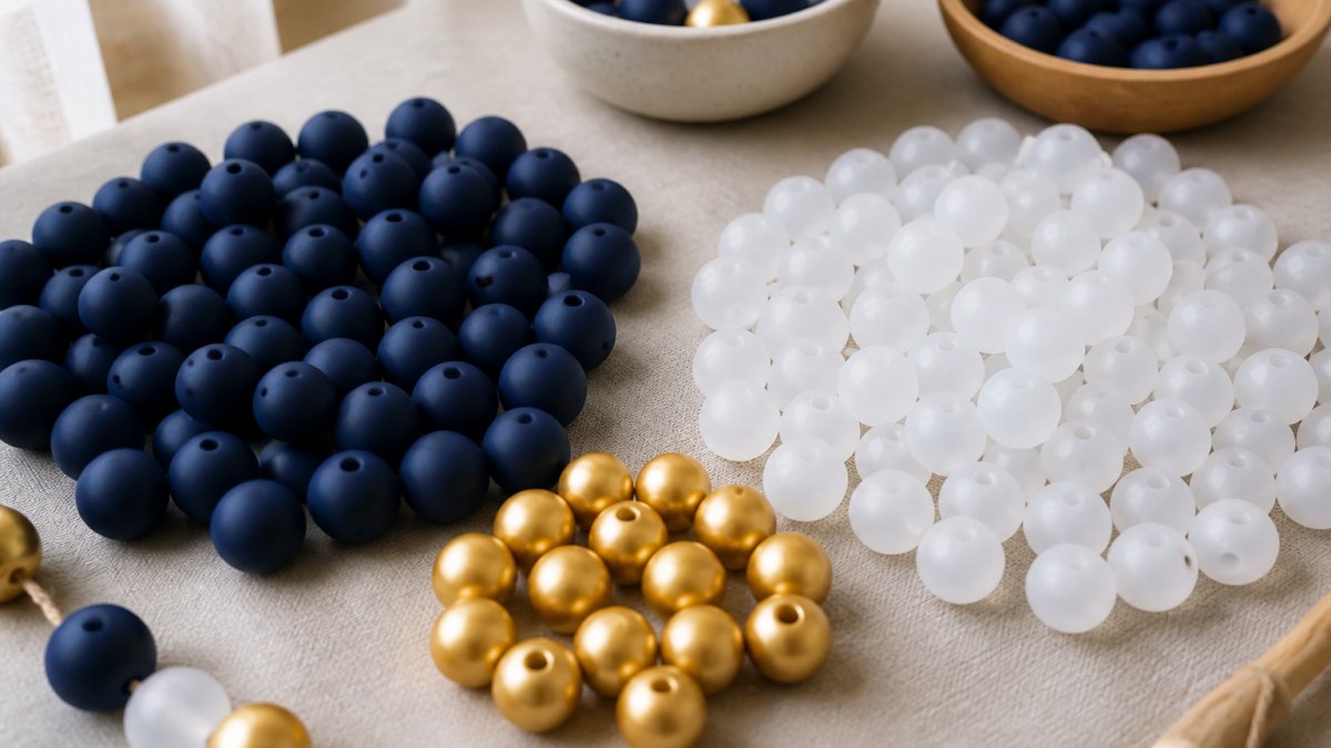
Apply this to a bracelet: 60% navy blue beads, 30% white beads, 10% gold metallic beads. The navy dominates. White provides contrast. Gold accents catch light and draw attention.
How Bead Finish Affects Color Matching
The finish of a bead changes how you perceive its color. This is crucial and often overlooked.
Opaque, Transparent, and Matte Finishes
Opaque beads are solid. Light doesn't pass through them. What you see is what you get. An opaque red bead looks like solid red from every angle.
Transparent beads allow light to pass through. The color shifts depending on the light source and angle.
Metallic and Luster Finishes
Metallic beads have a shiny, reflective surface that mimics metal. Gold, silver, and copper metallics add glamour and catch light dramatically.
Alphabet Letter Beads Color Coordination
Alphabet letter beads add personalization to designs. Matching their colors to your bead palette requires intentional choices.
Digital vs. Physical Color Matching
Your screen shows colors differently than real life. What looks perfect on your phone might disappoint when it arrives.
Step-by-Step Process for Choosing Matching Bead Colors
Follow this process and you'll make confident decisions every time.
Step 1: Define Your Color Palette
Start with inspiration. Find a color you love. It might come from nature, fashion, a photo, or pure instinct.
Step 2: Test Bead Combinations in Different Lighting
Lighting changes everything. A color that looks perfect in sunlight might look dull indoors. Test in multiple light sources.
Step 3: Consider Bead Size and Shape Impact
Larger beads show color more prominently. A small accent bead of a bright color reads differently than a large focal bead of the same color.
Step 4: Order Samples Before Committing
Never order large quantities of untested combinations. Order small sample packs first.
Common Mistakes to Avoid When Matching Bead Colors
Learn from others' missteps. These mistakes derail even experienced crafters.
Frequently Asked Questions
How do I know the silicone beads I order will match the colors I see on the website?
Lighting and screen settings affect how colors appear online. Always order a small sample before committing to a full project. Test your beads in natural daylight and indoor lighting where you'll actually wear or display the finished piece. The 15 mm Solid Silicone Beads 20 pack from Barkers Creative Designs is an affordable way to test colors before scaling up. Keep in mind that bead finish (matte, metallic, transparent) also changes how color appears in different lighting conditions.
What's the best way to use the 60-30-10 rule for choosing matching bead colors?
The 60-30-10 rule means 60% of your design uses your dominant color, 30% uses a secondary color, and 10% uses an accent color. For example, in a keychain, use 60% neutral beads, 30% of a complementary shade, and 10% metallic or contrasting beads. This creates visual balance without overwhelming the design. Start by choosing your dominant color first, then select supporting colors that either match (monochrome) or contrast (complementary) with it.
How do I coordinate alphabet letter beads with my bead color scheme?
Treat letter beads as either a focal point or accent element in your color palette. If letters are opaque, they'll stand out more than transparent beads, so match them to your dominant or secondary color. For subtle letter integration, choose letter beads in a shade that blends with surrounding beads. Use spacer beads like the 12 mm Silicone Lentil Spacers 40 count mixed to separate letters and create visual breathing room while maintaining color harmony throughout the design.
Does bead finish really change how colors look when matching?
Yes, significantly. Opaque beads show true color, while transparent beads appear darker and more saturated. Matte finishes absorb light and look more subdued, while metallic and luster finishes reflect light and appear brighter. When matching colors, always compare beads with the same finish type. If mixing finishes, test them together first, a matte bead and metallic bead in the same color family may look completely different when strung together.
Choosing matching bead colors becomes intuitive once you understand the fundamentals. The color wheel, harmony principles, and finish considerations give you a framework for confident decisions. Start with small sample packs from Barkers Creative Designs, test in real lighting, and trust the process. Your designs will feel intentional and polished because they're built on solid color theory rather than guesswork.